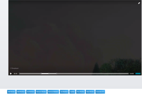
This example demonstrates configuring the plugin with custom colour and styles for each marker.
Color Css Style Config
The style name style referencing a css selector can be configured like so:
#colors .marker-cue.one { background-color:#000000;}
#colors .marker-cue.one:hover { background-color:#CCCCCC;}
#colors .marker-cue.two { background-color:#CCCCCC;}
#colors .marker-cue.two:hover {background-color:#FFFFFF;}
#colors .marker-cue.three {background-color:#999999;}
#colors .marker-cue.three:hover {background-color:#FFFFFF;}
Refernce the css selector with the style property
{
  "startTime": 120,
  "endTime": 180,
  "style": "one"
}
   <div class="flex w-full">
          <div id="colors" class=""></div>
  </div>
<script type="text/javascript">
  	var player = flowplayer("#colors", {
    "clip": {
        "markers": [
            {
                "endTime": 180,
                "startTime": 120,
                "style": "one"
            },
            {
                "endTime": 360,
                "startTime": 300,
                "style": "two"
            },
            {
                "endTime": 570,
                "startTime": 510,
                "style": "three"
            }
        ],
        "sources": [
            {
                "src": "https://videos.electroteque.org/bitrate/big_buck_bunny_2000k.webm",
                "type": "video/webm"
            },
            {
                "src": "https://videos.electroteque.org/bitrate/big_buck_bunny_2000k.mp4",
                "type": "video/mp4"
            },
            {
                "src": "https://videos.electroteque.org/bitrate/big_buck_bunny_2000k.ogv",
                "type": "video/ogg"
            }
        ]
    },
    "share": false
});
</script>